Examples: Please click here to view examples illustrating most of what I am talking about below >>>.
Design: I tend to see presentations as a sub-domain of editorial design, or rather as a hybrid between editorial design and info-graphics. Printed presentations work very much like editorial page layouts. When it comes to slide presentations however there is one very big difference which does take some adjusting to for graphic designers since it goes against pretty much everything that we hold precious in typography: The type on slides has to be big enough to be clearly legible on a projector! – ouch!
Printed Presentations: If your presentation is to be printed as a poster, then you have to think of it as almost like the double page spread of a magazine, with grid, columns, headlines, spots and photo captions – only blown up to a huge big size. The layout should have focal points, clustering, observe the rules of negative space and directional axes very much like as if it were a hand held publication.
The one above is a conference poster which I made for a collaborative project in 2006 (click on upper image for a really big size where you can see details). It was printed 2 meters wide and shown at the poster session of the Towards a Science of Consciousness conference in Tucson in 2006. At the time we had nothing but very vague ideas so all of the visual material you see here is simulated or completely invented/imaginary, put into the poster just to give an idea of what we were aiming for. We did have a lot to “say” however, and this made up the text which was placed alongside the images. See/Read more here on behance >>>.
Very often the format which is required at poster sessions held during conferences will be vertical rather than horizontal. In this case you simply structure your presentation as a single page editorial layout, again with columns, grid etc:

______________________________
Slideshow presentations: If your presentation is to be shown on a screen then you will usually make a slideshow. One advise I have is to not to use pdf slideshows for this, no matter how easy it may be to compile a pdf document from your graphic design software. Reason is very simple and obvious: pdf will not give you transitions and transitions – if you use them intelligently – will add a lot to your work, since they work very much like the negative spaces which we put between informational content – they provide a temporal “space”.
Powerpoint: The universal slideshow software is powerpoint. However, as your graphic design instructor I cannot in all clear conscience tell you to use powerpoint in its native format.

Too true!
I do not think that I have used the native interface of powerpoint even once. What I do instead is make 1024 x 768 JPEG images in photoshop and drag and drop them onto a blank slide page. Powerpoint is clumsy, a nightmare to align things with, doesn’t have nearly enough nice effects and transitions (just check out proshow and you will see what I mean). Not to even mention the fact that I am really not the organized sort of person who puts bullet points on her presentations – but!… All that said, it is the only slideshow presenter that you can count on to work anywhere and everywhere, so that is the one you end up cobbling things together in.
So, again – here we go:
Structural elements of a slideshow: Unless a slideshow has distinct differentiations between its sections it will probably turn into a very boring viewing experience. One of the most powerful aids at your disposal are the transitions which I already started talking about above. If you use one consistent transition effect throughout your presentation (a simple one, say a fade) and then put fancier transitions (say, a blind or a push) only between slides which mark the beginning and the end of sections you will be able to create a visual effect which tells your audience that something new is coming. If you make the durations of all the regular transitions short and the irregular ones long, again this will mark a differentiation. Look at this one for an example where I used very plain fades in all of the slides and used a push effect only when I actually moved on to the next section.
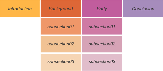
Another good way of marking structure is through color. In the powerpoint linked into the previous paragraph you will see that I am also using colored circles to navigate the viewer through the particular topics which I am talking about. But you can also use color to set up a full presentation structure by coloring the backgrounds of the slides that make up the individual sections of your presentations in differentiated hues picked by using a color wheel. Thus, much like the transitions, the changes in color from one section to the next will alert your viewers to a change in topic:


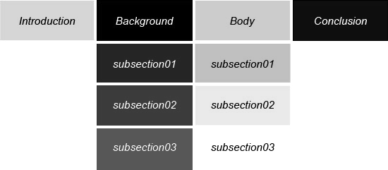
Another trick is to invert the backgrounds of alternate sections so that you switch back and forth between dark and light as you go from one to the next.
And finally, you can of course insert sounds which will also mark out beginnings and endings of structural sections – as long as they are really subtle and do not in any way distract from the flow of the presentation!
Background color: Since slide presentations are meant to be viewed on a screen or via a projector the rule of thumb is to use background color in such a way that the visual elements which are placed on top of it do not flicker. Best advice is to stay away from pure white and pure black but use slightly muted down values, such as very pale grays or deep charcoals, instead.
Again, if you use highly saturated color fields as a background or as shape elements make sure that you do not get a flicker, which means that whatever you put on them better be desaturated, in fact preferably grayscale, both in terms of type and images.
Slideshow effects: Almost all presentations softwares will give you the ability to add effects to your design elements such as animated type entries and so forth. These are OK to use, as long as you treat them only as hierarchical aids. In other words if every piece of type in your presentation is jumping around then you have a structural mess. If only a few really important things, and only maybe 5 times throughout a 20 slide presentation, have an animation attached to them – then you are using the animations in such a way that they actually underscore the hierarchical importance of the content. If you do use animations then that will mean that these are added inside the presentation software, which will mean that in all likelihood they will be very tough to align (unless you are using something really sophisticated like proshow, of course). So, these will involve a lot of prior planning in the images which you create in photoshop and a lot of testing out, tweaking and going back and forth between applications – so be aware that using them will mean a lot of extra design work!
Designing the slides: Again, treat the design process of a slideshow exactly as you would proceed with any multi-page editorial document:
1) Continuity: Your presentation should have design consistency. This is so obvious that I feel funny even writing this out, but nonetheless here are the things to bear in mind:
i) Alignment: All of your slides should have the same alignment scheme. Which means that if you start out with a left side alignment then stick with it and do not suddenly switch over to a centered or a right side alignment half way through! Use guides in your image editor to align elements and stick with these guides so that your stuff doesn’t jiggle from one slide to the next. Again, keep your sentences aligned by always using the same type leading and placing the type box onto horizontal guides as well as vertical ones.
ii) Consistency of visual elements: Use the same fonts and visual elements throughout. Do not start out with one set of fonts and then switch to another. Do not frame some of your images in rounded rectangles and then others with sharp 90 degree cornered ones. Do not use full bleed images, silhouettes, a variety of crops such as circles, squares and rectangles, all in one presentation but stick to one visual scheme only – such as only bleeds and rectangular crops for instance.
iii) Consistency of color scheme: Do not switch between color schemes. In other words if you start out with a low saturated scheme stick with it, don’t switch to high sat halfway through. Example: In the two color schemes that I am showing above the upper one sticks with a highly saturated scheme whereas the lower one sticks with black and white.
2) Hierarchies: These will give you the most concern since the type on your slides needs to be large enough to read easily, which means that negative space will not be readily available. The good news is that you can spread your content out over several slides and do not need to squish everything into the same visual space. Here are some tips to get around hierarchy issues:
i) Use color as a hierarchical element. Colorize some of your text to stand out through its color values.
ii) Use type size as a hierarchical element. Size certain words up to make them more prominent.
iii) Use arrows and graph structures to establish hierarchies and clusters.
3) Typography: Your type should be very clearly legible. This is the golden rule! Stay away from all fancy fonts, serifs with very thin strokes, etc. The good choices are clear grotesk typefaces such as Arial, Franklin Gothic and serif typefaces such as Garamond, Times New Roman. As already said above you can use different fonts sizes to establish hierarchies and slide presentations are one of the few media where using colored type actually works – if you know how to do it!
4) Integrating images: This is where most slide presentations fall flat on their faces, so be very very very careful when working with images! The problem is that most presenters try to foreground everything in a slide show. A good trick is to place some things in the background and images are the best option for that. Place large, full screen images in the background and then place the type on top of them, either in boxes or embedded into suitable areas of the image itself. Another good trick is to place images separately on their own slides. And definitely a good trick is to alternate between slides which have only textual content and those that have images.
5) Integrating shapes: Stay away from cute animated clip art! That would have to be rule number one! Obviously! That said, shapes, especially graphs and arrows are very good things to use since they will give you directional axes, which are things you will need to make usage of as much as you can. Again, color fields and boxes for type are very good hierarchical separators.
Examples: Please click here to view examples illustrating most of what I am talking about above >>>.


Leave a comment